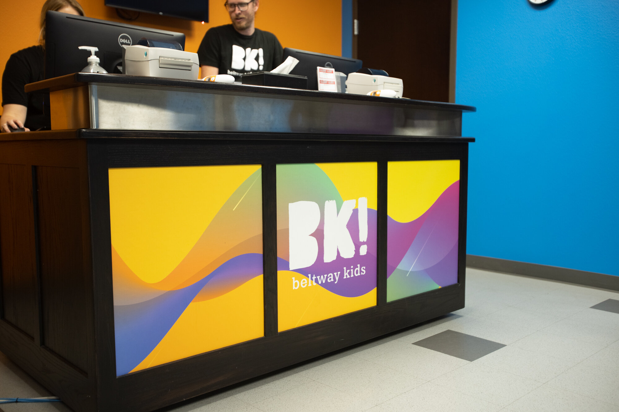
Beltway Kids’ branding was confused. It wasn’t ever officially established in the first place and didn’t have a clear look.
They came to me with this request, they wanted color (a lot of color) but wanted be able to change it up seasonally without having to rebrand or have it mess up their look. So after some careful consideration and really thinking through all the places this logo needed to live, we came up with this… a bold and big BK! that was fillable. Basically a catchall for color and fun and patterns. It works in one color and it works with a busy pattern of robots and ballerinas. It’s modern but kid-friendly and customizable based on the event it’s being used for.


